


Case Study:
Rhino Life Conservatory
Design for Social Good

Project Overview
The Problem
Rhino Life Conservatory needed a way to grown membership and raise funds in spreading awareness about endangered Rhino populations globally.
The Product
Rhino Life Conservatory (RLC) is a non-profit organization that spreads awareness and support for endangered populations of Rhinos globally through membership and fundraising projects.
The organization needs a way to grow membership and fundraising efforts while giving activists an incentive to join.
My Role
UX Designer & Researcher (Project 3 for Coursera’s Google UX Design Certificate Program)
The Goal
Design an app and responsive website for social good that spread awareness and action to Rhino conservation through fundraising efforts and membership growth.
Responsibilities
My responsibilities throughout the project included user design and research, wireframing, usability testing, competitive auditing, iteration on design and lo-fi/hi-fi prototyping, determining information architecture and responsive design.
Tools Used
Adobe XD, Paper, Marker
Project Duration
February 2022 - March 2022

Understanding the User
I conducted interviews with several participants who were interested in supporting environmental causes with the effort to protect endangered populations.
Participants were interested in supporting a cause for social good and wanted a way to contribute to a cause while also being informed and subscribed to be notified of news, updates and information related to the cause.
Persona & Problem Statement
Mattias is a full-time worker with a busy social life who needs a way to stay updated on missions he supports.

Jon is a zoology student who needs a way to support causes for conservation and species preservation.

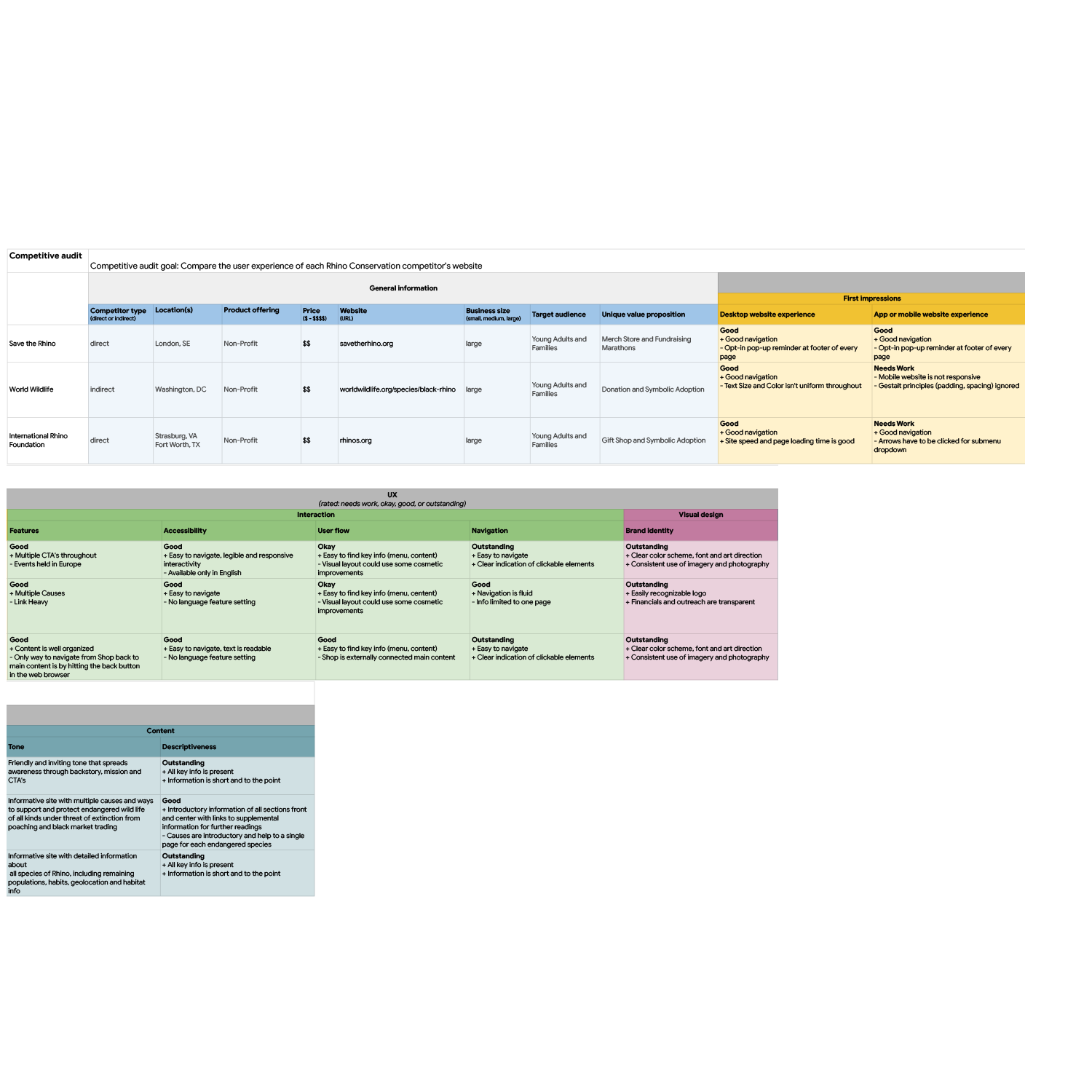
Competitive Audit
For this third and final project in the Google UX Design Certificate program, I chose Rhino Conservatory as means to design for social good. I took a look at three competitors to provided direction on gaps and opportunities to address with building out the initial user flow of a Rhino Conservation app and responsive website.
Ideation
I did a quick ideation exercise to come up with ideas for how to address gaps identified in the competitive audit. My focus was specifically on growing membership and raising funds through awareness, giving users an incentive to contribute.


Starting the Design
Digital Wireframes
After ideating and drafting some paper wireframes, I created the initial designs for the Rhino Life Conservatory app. These designs focused on fundraising through symbolic adoption.

Capture the user’s attention with a compelling image, such as a picture of a baby Rhino.
Big bold header text to signal to the user they were in the right place.
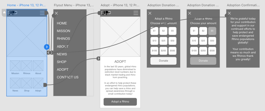
Lo-Fidelity Prototype
To prepare for usability testing, I created a low-fidelity prototype that connected the user flow of symbolic adoption as means to contribute funds to help spread awareness and preserve endangered populations.
View the Rhino Life Conservatory lo-fidelity prototype
Usability Study Parameters
An unmoderated usability study was conducted remotely involving five participants. The user flow testing lasted 5-10 minutes.
Usability Study Findings
Participants felt frustrated with pricing tiers for contributions.
Participants were interested in exploring other areas of the prototype.
Participants wished for a Shop section to purchase items from to help support the cause.
Refining the Design
UI Kit
To build my initial UI Kit, I looked to my competitors exampled from my competitive audit, to better understand their use of color, style and layout for building my mockups.

Mockups
Based on the insights from the usability studies, I applied visual design changes to include images, buttons and color. I referenced competitors UI layouts to help with deciding on the initial visual style of the mockups throughout my hi-fidelity prototype.
Before usability study

After usability study
I also included a “Custom Amount” button for users who’d like to make a personal denomination contribution.

Before usability study

After usability study

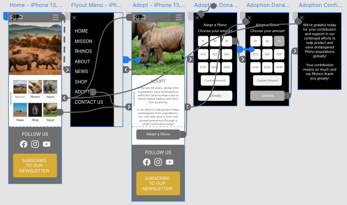
Hi-Fidelity Prototype
The hi-fidelity prototype followed the same user flow as the low-fidelity prototype, including subtle color and text/button resizing design changes made after the usability study.
View the Rhino Life Conservatory hi-fidelity prototype
Accessibility Considerations
Hierarchy & Readability
Readable header and content text, including screen reader compatibility and optimization.
Interactive Elements & Labels
Clear labels for interactive elements that can be read by screen readers.
Navigation & User Flow
Easy to locate labels and buttons for navigation and user flow.
Responsive Design
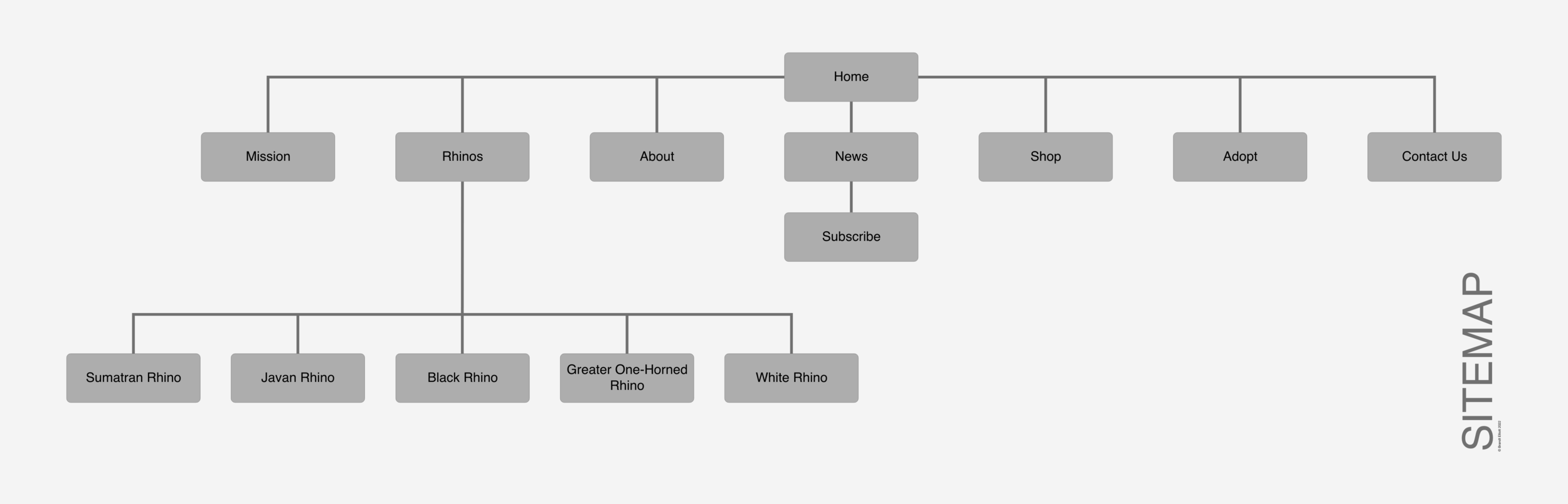
Information Architecture Sitemap
Once the app designs were completed for the initial user flow, I started work on designing the responsive website. I used the Rhino Conservatory sitemap to guide the organizational structure of each screen’s design while keeping cohesiveness and consistency front and center.
Responsive Design
The designs for screen size variation included mobile, tablet, and desktop. Designs were optimized to fit specific needs of users for each device and screen size.
Going Forward
Takeaways
Impact
Users shared that they’d like multiple ways to support organizations that have a positive impact on spreading awareness about the environment and endangered populations of species through various means of ways to make contributions.
What I Learned
Designing a mobile app and responsive website for social good is a marathon, and although covering one user flow gives way to varied array of information, the impact of a fully fleshed out system could be even more impactful towards spreading awareness and making real change.
Next Steps
User Flow
Continue to build on the user flow by fleshing out other main navigation sections.
Wireframes & Mockups
Flesh out the content of future wireframes for other main navigation sections.
Ideation
Build on additional streams of fundraising by ideating other ways in which users can contribute to cause.